Mixing Colors - A universe of Opportunities
Share
Should I choose the color or should I let the color choose the artwork? The process involved when working with colors in art is intriguing. How the color appears on one media in regard to another and how the colors interacting with each other, I find truly remarkable. Or how one color signals a mood in one context and another mood in another, when the motive is different. The process of selecting colors for an artwork can be done in several different ways.
When doing design for a product or making a concept design or mood board for a video production, the choice of the colors for the product or selection of a color palette will often depend on the specific target audience. What story is being conveyed and what impression is the product going to give? Is the product or the video for young people and which cultures is it meant to appeal to? In those cases, the color selection will be based on the perceptions others have towards certain colors with the motive of selling a productive.
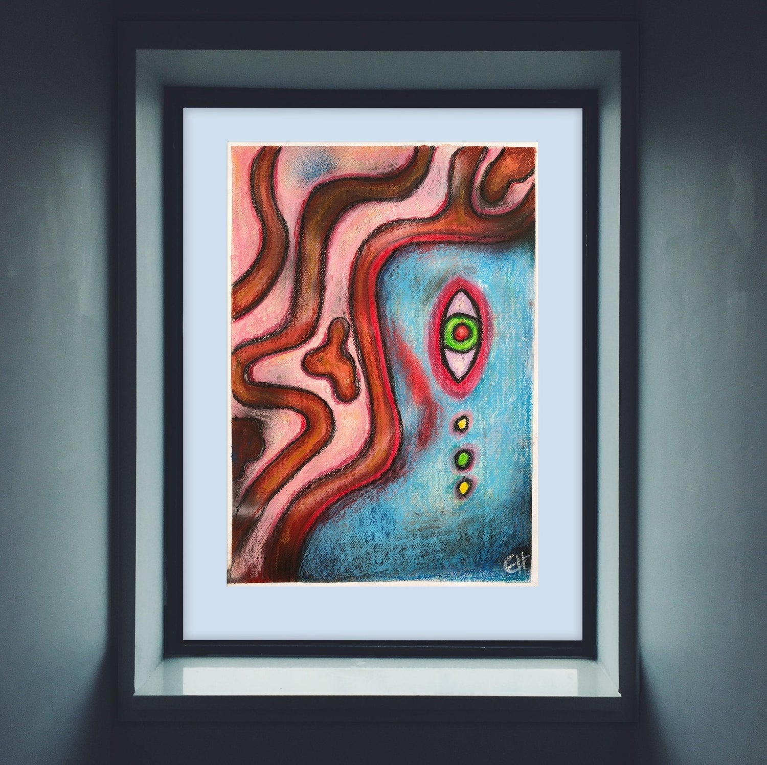
Classic color theories and principles are used and applied in these scenarios and is playing a dominant part when selecting colors for an art piece. That said, in art, there are various methods that are used when color choices are made. Personally I have found it very interesting to explore intuitive color selections or experimenting with atypical color combinations. The color selections becomes a part of the process and creates the artwork, like the artwork is finding the color that belongs to it.
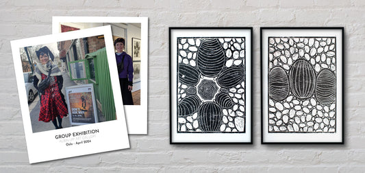
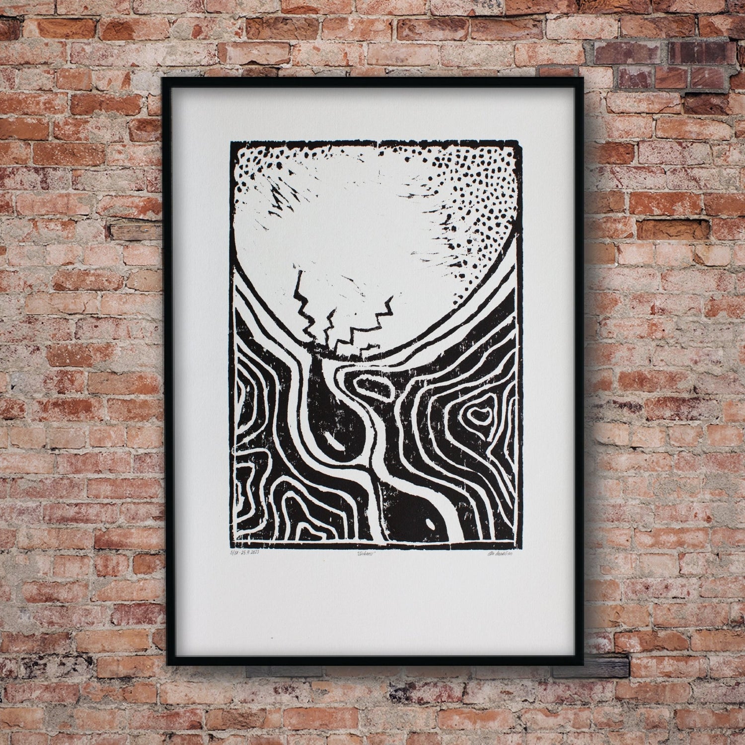
When working with print ink and color mixing is a pigment color, every color added will make the color darker, unless white is added. To mix the intended color, skill and practice is needed. Small amounts of colors can make a big difference for the hue, shade and saturation of a color. Recently working on some woodblock prints from the series “Return to Earthiness” I enjoyed mixing ink colors together with South African artist, Ezequiel Mabote. The aim was to create earthy colors that both would work with the composition of the artwork and give it an organic feel. I also wanted the placement of the different colors to add shape to the faces in the wood in an atypical way.

First, a mustard color color was mixed. This was achieved by mixing yellow color with a hint of black. This basically just makes the yellow a darker shade and less intense and it gives it a mustard feel. This color was applied with rolls and printed to the paper, making up the background of the artwork. Later a turquoise color leaning towards teal, was mixed. When applying the color on top of the mustard surface, it was awesome to see how it interacted with the overlapping color in the artwork, and it came out slightly different than expected, because of the transparent of the colors overlapping each other. This turning the turquoise teal almost into a mid-green color because of the yellow overlapping color. The combination brought interest and earthiness to the artworks. As boards were cleaned from the mixed colors, very earthy combinations happened and a collaborative abstract piece were printed out of it.
What a gift color is! Surrounding us in nature and refreshing and cherishing our souls. When chosen for artworks or when the color chooses the piece, it brings beauty and intrigue into the artwork. What exciting days when working with color! Thank you so much to Ezequiel Mabote for the art collaboration and allowing me to print in your studio and to Lars Erik Hauklien for capturing the moments behind the scenes.
